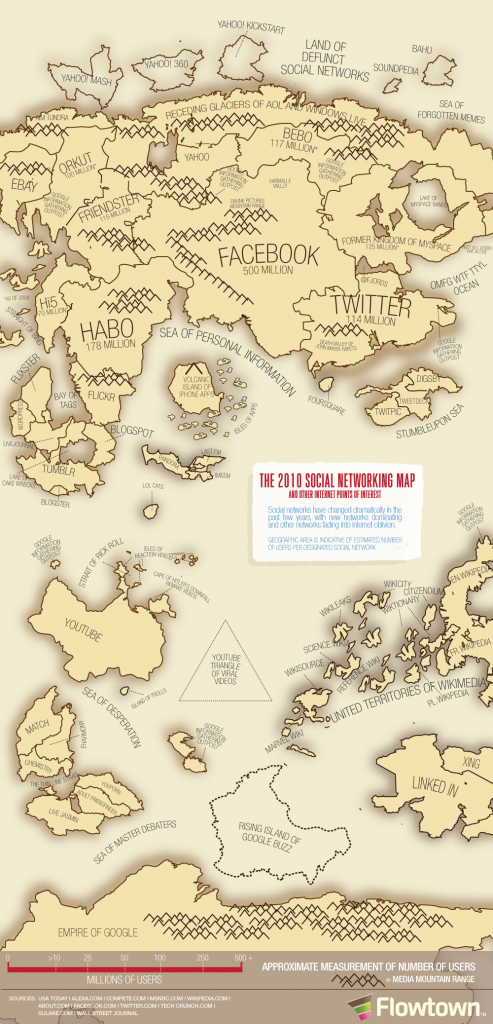
The creative people at Flowtown have created this fabulous social networking map:
It is very interesting to look at social media use in terms of country populations; this could be useful to share with colleagues and students. What are your thoughts about the popularity of some of the tools?


Pingback: Tweets that mention Social networking map | Bright ideas -- Topsy.com
Fascinating seeing this map. I find it interesting that Habo is so big and I’ve never heard of it. Really allows you to see how big social networking has become. Thanks for sharing.
Very neat! This would be a great way to show schools effective ways to communicate with families and school communities using social media. They could focus efforts on those methods that have the largest populations.